Why Mobile-Friendly Website Development Matters for Modern Businesses
by
SigmaIT Softwares
Posted on 10/3/2026 5:09:22 PM
A potential customer finds your business through a search, taps your website, and lands on a page where the text is too small, buttons are difficult to tap, and the layout keeps shifting. Within seconds, that visitor may leave and look for another option. The problem is not necessarily your product or service. The problem is that the website did not work well on the device the customer was using.
This is why mobile-friendly website development has become an important part of building a business website. A mobile-friendly site adjusts its layout, content, navigation, images, and interactive elements to different screen sizes. More importantly, it creates a smoother experience for people who increasingly use smartphones to search, compare businesses, read information, and make enquiries.
What Is Mobile-Friendly Website Development?
Mobile-friendly website development means creating a website that remains easy to use on smartphones and other smaller screens. Instead of simply shrinking a desktop website, developers structure the website so that its content and functionality adapt to different devices.
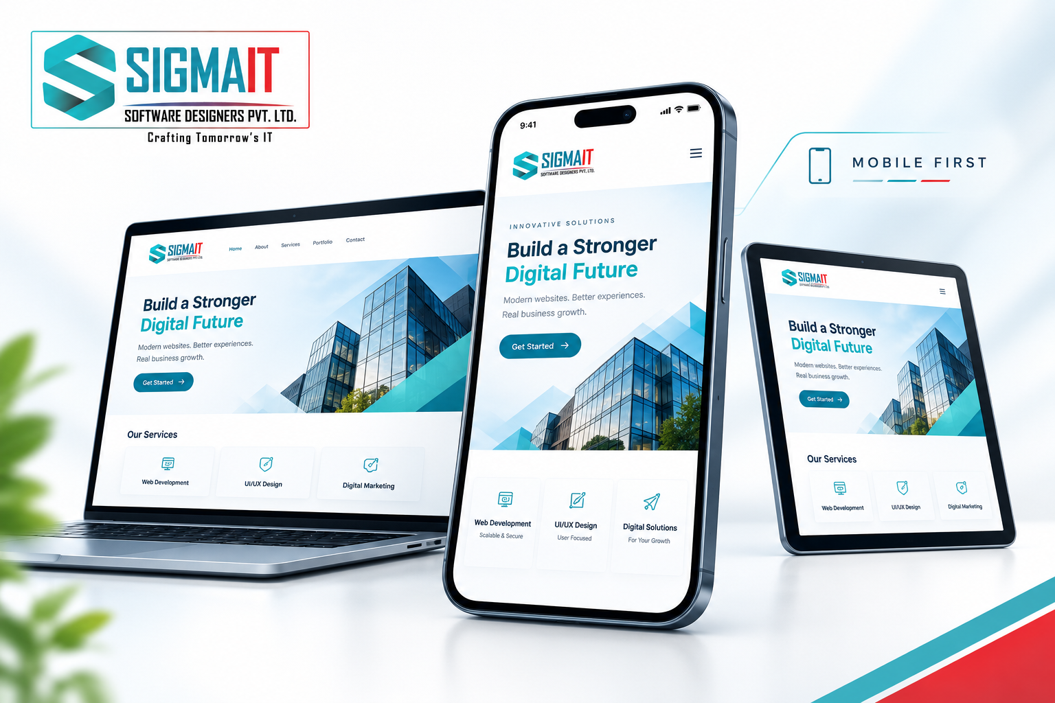
Responsive web design plays a major role here. A responsive website can adjust layouts, images, fonts, menus, and other elements according to the available screen space. As a result, visitors do not need to constantly zoom, scroll sideways, or struggle to find important information.
However, mobile optimisation involves more than screen size. Developers also need to consider loading speed, touch-friendly buttons, readable typography, simple navigation, accessible forms, and the overall mobile user experience. Therefore, mobile-friendly website development should be considered from the beginning rather than treated as a final adjustment.
Why Mobile-Friendly Website Development Matters for Businesses
Consider how a customer might interact with a local business. They could search for a service while travelling, compare two websites from their phone, check the business location, and call directly from the website. If the site makes these actions difficult, the business can lose an enquiry before the customer even understands what it offers.
A mobile-friendly website removes many of these unnecessary obstacles. Visitors can read content comfortably, move between pages, complete forms, view products, and contact the business without changing devices. Consequently, businesses can create a more consistent experience while making it easier for visitors to take the next step.
How Responsive Web Design Improves User Experience
A desktop website often has enough space for large navigation menus, multiple columns, wide images, and detailed layouts. A smartphone does not. Responsive web design reorganises these elements so that the page remains practical on a smaller screen.
For example, a multi-column layout may become a single-column layout on mobile, while a desktop navigation menu may turn into a compact mobile menu. Images can resize without breaking the page, and buttons can receive enough space for comfortable tapping. These small design decisions can significantly improve how visitors interact with a website.
Moreover, mobile users often want information quickly. A well-planned mobile interface can place important information such as services, contact details, product information, location, pricing, or enquiry options where users can find it without unnecessary scrolling.
Mobile-Friendly Website Development and SEO
Mobile optimisation also matters for search visibility. Search engines evaluate how websites perform across devices, and Google's mobile-first indexing means Google primarily uses the mobile version of a site's content for indexing and ranking.
Therefore, businesses should not treat mobile responsiveness as a separate design concern. A website that hides important content on mobile, creates usability problems, loads slowly, or provides a poor mobile experience can create technical and SEO challenges.
A strong website development process should consider mobile page structure, crawlability, internal linking, metadata, structured data, image optimisation, Core Web Vitals, and other technical SEO requirements. When developers and SEO professionals work together, the website can provide a stronger technical foundation for ongoing search optimisation.
Why Mobile Website Speed Matters
Imagine waiting several seconds for a service page to load while using a smartphone connection. Even if the content is excellent, the visitor may decide that the website is not worth the wait. This makes website performance an important part of website development.
Developers can improve performance by optimising images, reducing unnecessary scripts, using efficient code, applying suitable caching techniques, and choosing appropriate hosting infrastructure. At the same time, businesses should avoid adding unnecessary animations, plugins, trackers, or third-party services that can increase page weight.
Fast loading does not only improve convenience. It can also support better engagement because visitors can reach the information they need sooner. Consequently, performance should be considered during development rather than left entirely for post-launch optimisation.
Mobile-Friendly Websites Can Support Better Conversions
A website does not exist only to provide information. For many businesses, it needs to generate enquiries, calls, bookings, purchases, registrations, or other actions. Mobile-friendly development can make these actions easier to complete.
For instance, a service business can place a clearly visible enquiry or call option on mobile. An ecommerce website can simplify product browsing and checkout. A real estate website can make property searches and enquiry forms easier to use. Similarly, an education website can make course information and registration forms more accessible.
However, responsive design alone does not guarantee more conversions. The content, offer, pricing, trust signals, page structure, and overall customer journey also influence user behaviour. Mobile optimisation simply removes one important source of friction.
Accessibility and Mobile Usability Go Together
Good mobile website development should also consider accessibility. Text needs to remain readable, interactive elements should be easy to identify and use, and forms should provide clear instructions. Colour contrast, keyboard accessibility, meaningful labels, and logical page structures can also make websites easier to use.
These improvements benefit more than users with specific accessibility needs. Clear navigation and readable content can make the website easier for everyone, especially people using smaller screens or accessing the site in less-than-ideal conditions.
How Businesses Can Build a Mobile-Friendly Website
Mobile optimisation works best when it becomes part of the development process from the beginning. Businesses should first identify how customers are likely to use the website and which actions matter most. Developers can then create layouts and user flows that work across different screen sizes.
Before launch, the website should also be tested on different smartphones, tablets, browsers, and connection conditions. Forms, menus, buttons, images, videos, payment systems, and other interactive features should be checked carefully. After launch, analytics and search performance data can reveal where mobile users encounter problems and where further optimisation may help.
Final Takeaways for Mobile-Friendly Website Development
Mobile-friendly website development is no longer simply about making a desktop website smaller. It involves creating a website that remains fast, readable, accessible, easy to navigate, and useful across different devices.
For businesses planning a new website or redesign, mobile responsiveness should be included in the core development strategy alongside UI/UX design, SEO, performance optimisation, security, and conversion planning. Start by identifying the actions customers need to complete, design those experiences for smaller screens, test the website thoroughly, and continue improving it using real user and performance data. A website built with mobile users in mind can provide a stronger foundation for customer engagement and long-term online growth.