responsive web design service in india
by
SigmaIT Softwares
Posted on 5/12/2026 3:38:21 PM
Responsive Web Design Service in India - Build Websites That Work on Every Screen, Every Time
Think about the last time you visited a website on your phone and had to zoom in just to read the text — or worse, the buttons were so small you kept tapping the wrong one. Frustrating, right? Now think about your own business website. Is that the experience you are giving your customers?
A website that does not adjust properly on different screen sizes can affect user experience, search rankings, and business growth. That is why businesses now prefer Responsive Web Design Service in India to create websites that work smoothly on every device. India now has over 750 million smartphone users, and that number is climbing every month.
In this page, you will learn what responsive web design actually means, why your business needs it urgently, what our services include, and how you can get started with a website that genuinely works for your audience.
What Is Responsive Web Design? A Simple Explanation
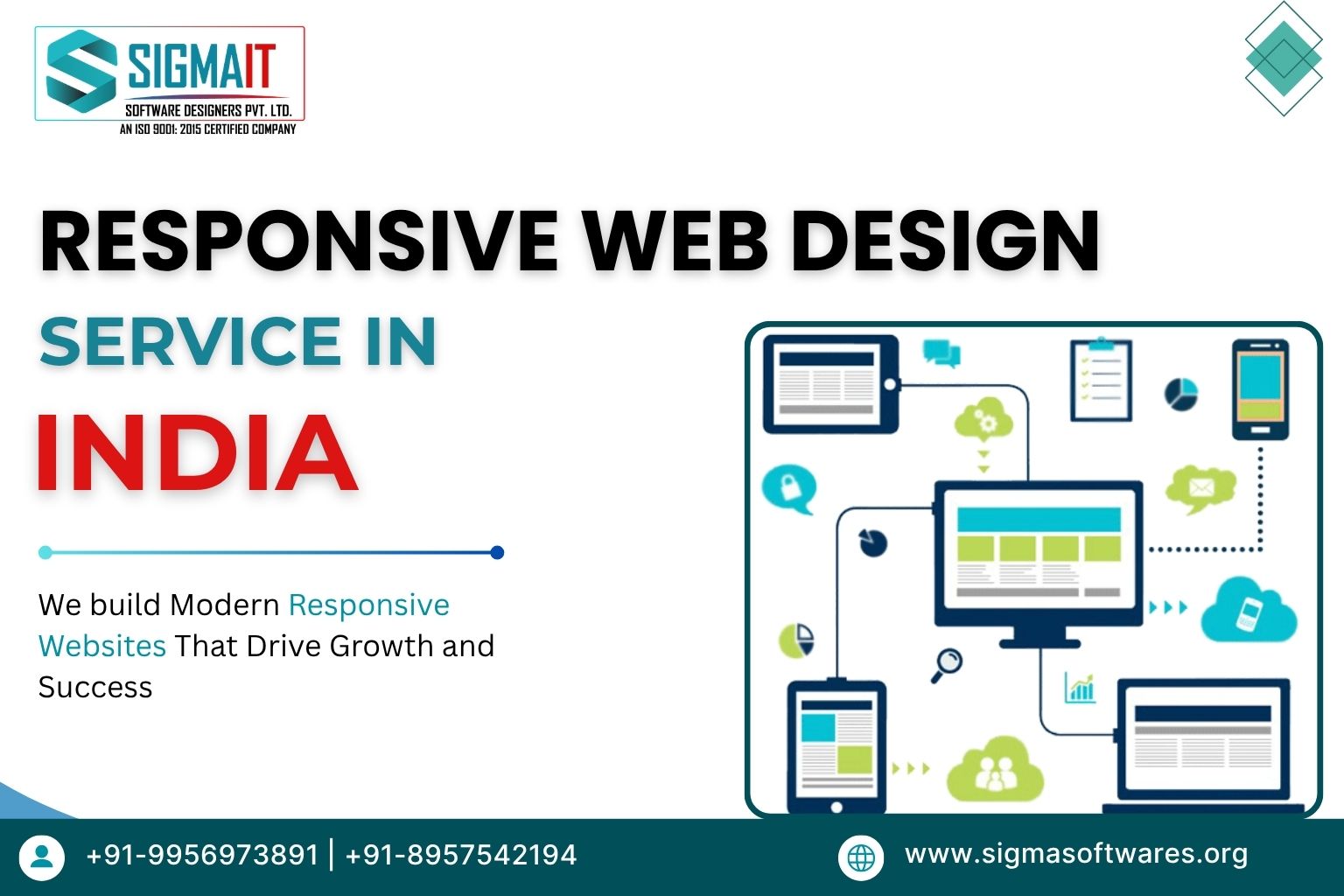
Responsive web design is a way of building websites so that the layout, images, text, and all other elements automatically adjust themselves depending on the screen size being used. Instead of building separate websites for mobile and desktop users - which is expensive and hard to maintain - a responsive website has one codebase that adapts to any screen.
Three core technologies power this approach:
-
Fluid Grids: Your website's flexible backbone that stretches or shrinks to fit any screen width without breaking the layout.
-
Flexible Images: Smart visuals that resize automatically within their containers so they never overflow or distort on any device.
-
CSS Media Queries: The intelligence layer that detects the user's screen size and applies the correct set of design rules instantly.
A responsive website provides a smooth browsing experience on:
-
Smartphones
-
Tablets
-
Laptops
-
Desktop Computers
Unlike old fixed-width websites, responsive websites improve readability, navigation, and performance without requiring separate mobile versions.
The result? One website that gives every visitor, regardless of their device, a clean, comfortable, and consistent experience.

Why Responsive Web Design is Important for Businesses in India? Benefits!
India has one of the highest numbers of mobile internet users. Most customers search for products and services through smartphones. If your website is not mobile-friendly, visitors may leave your site quickly.
If you are a business owner in India and you are still running a website that is not fully responsive, here is what is actually happening behind the scenes:
1. Better User Experience
A responsive website creates a consistent and smooth experience for users on smartphones, tablets, and desktops. Visitors can easily read content, click buttons, and navigate pages without frustration. Better user experience helps businesses increase customer trust, engagement, and overall website performance.
2. Improved Google Rankings
Google prefers mobile-friendly websites in search engine rankings. A responsive website improves website structure, page speed, and usability, which positively impacts SEO performance. Businesses investing in responsive website designing companies in India can improve online visibility and attract more organic traffic.
3. Faster Website Loading
Responsive websites are designed using optimized layouts, lightweight coding, and mobile-friendly technologies. Faster loading speed reduces bounce rates and improves user retention. A fast website also creates a positive impression on visitors and supports better search engine performance.
4. Higher Conversion Rates
A responsive website makes it easier for users to contact businesses, fill inquiry forms, purchase products, or book services. Easy navigation and smooth browsing increase customer satisfaction and improve conversions. Businesses can generate more leads and sales through a professionally designed responsive website.
5. Easy Website Management
Managing one responsive website is easier and more affordable than maintaining separate desktop and mobile websites.
Responsive Web Design vs Mobile App - Which is Better?
Many businesses compare responsive websites with mobile applications before investing.
1. Responsive Websites
2. Mobile Applications
For most businesses, a responsive website is the ideal first step for building a strong online presence.
Common Mistakes to Avoid in Responsive Website Design
While creating a responsive website design, businesses often ignore important factors that affect user experience, SEO performance, and mobile usability. Avoiding these common mistakes helps improve website speed, engagement, and conversions.
1. Slow Mobile Speed
A slow-loading mobile website can increase bounce rates and reduce customer engagement quickly. Many businesses use heavy scripts, large files, and poor coding structures that affect performance. A professional responsive web design service focuses on optimized coding, lightweight layouts, and faster loading speed to improve user experience and search engine rankings.
2. Poor Navigation Structure
Complicated menus and confusing navigation make it difficult for visitors to find important information. Mobile users expect smooth and simple browsing experiences on every device. A well-planned responsive website design company creates clear navigation structures, easy-to-click buttons, and organized layouts that improve usability and customer satisfaction.
3. Ignoring SEO
Many businesses design responsive websites without focusing on SEO-friendly structures. Ignoring mobile SEO can reduce website visibility on Google search results. Proper heading structure, mobile optimization, page speed, schema integration, and keyword placement are essential for improving rankings and attracting targeted organic traffic.
4. Unoptimized Images
Large and uncompressed images slow down website performance on mobile devices. Poor image optimization negatively impacts user experience and SEO rankings. Responsive websites should use properly compressed images, modern file formats, and adaptive image scaling to maintain quality while improving loading speed across all devices.
5. Non-Responsive Forms
Forms that do not adjust properly on smartphones create frustration for users and reduce lead generation opportunities. Small input fields, difficult buttons, and poor layouts affect conversion rates. A professional responsive web development company ensures inquiry forms, contact forms, and checkout pages work smoothly on every screen size.
Why Choose an Indian Responsive Web Design Company?
India has become a leading destination for professional website development services because of skilled developers, affordable pricing, and quality work standards.
1. Cost-Effective Website Solutions
Indian companies provide high-quality responsive websites at competitive pricing compared to many international markets. Businesses can get professionally designed, mobile-friendly, and SEO-optimized websites without spending excessive budgets. Affordable development costs help startups, small businesses, and enterprises invest in digital growth while maintaining excellent website quality and performance.
2. Skilled Development Professionals
Indian web designers and developers have strong technical expertise and industry experience. These professionals understand responsive website trends, user experience, and SEO requirements, helping businesses build websites that perform smoothly across all devices and support long-term business growth.
3. Timely Project Delivery
Projects are completed within deadlines while maintaining quality standards. Businesses receive regular updates, transparent communication, and proper testing before launch. On-time project completion helps companies start their online operations quickly and maintain smooth business workflows without unnecessary delays.
4. Global Quality Standards
Responsive websites developed in India are suitable for both domestic and international businesses. From website performance to mobile optimization and user experience, every aspect is developed carefully to meet global business expectations and create professional digital experiences for customers.
Why Ecommerce Websites Required Responsive Design?
Online shopping through mobile devices is growing rapidly in India. A responsive ecommerce website improves product browsing, customer engagement, and sales.
1. Mobile Shopping Experience
A mobile-friendly ecommerce website allows customers to browse products, compare prices, and place orders easily from smartphones. Smooth navigation, fast loading pages, and responsive layouts improve customer satisfaction and encourage users to spend more time exploring products online.
2. Responsive Product Pages
Responsive product pages automatically adjust images, descriptions, pricing details, and action buttons according to screen size. Well-designed product pages improve readability and make it easier for customers to view products comfortably on mobile devices, tablets, and desktop computers.
3. Faster Checkout Process
A responsive ecommerce website simplifies the checkout process for online shoppers. Easy payment options, mobile-friendly forms, and secure checkout pages reduce cart abandonment rates and help customers complete purchases quickly without unnecessary delays or technical issues.
4. Ecommerce SEO Optimization
Responsive ecommerce websites support better search engine rankings through mobile optimization, faster loading speed, clean website structure, and SEO-friendly coding. Proper ecommerce SEO optimization helps online stores attract targeted traffic, improve product visibility, and generate higher online sales.
Key Features of Our Responsive Web Design Services in India
We offer a complete range of professional web design services in India built around one core principle: your website must perform brilliantly on every device your customer uses.
1. Mobile-Friendly Website Layouts
Our mobile responsive web design services create layouts that adjust perfectly across all screen sizes. Users can easily browse pages, access menus, and interact with website elements without any display issues. This improves customer experience and helps businesses retain visitors for longer durations.
2. SEO Optimized Structure
We build websites using SEO-friendly coding standards and optimized page structures. Responsive websites with proper headings, mobile optimization, and faster loading speed perform better on search engines. This helps businesses achieve improved rankings and attract more targeted traffic organically.
3. Fast Loading Speed
Website speed plays a major role in user experience and search engine optimization. Our responsive websites use compressed images, optimized coding, and clean layouts to improve performance. Faster loading websites help reduce bounce rates and improve customer engagement significantly.
4. Cross-Browser Compatibility
Our responsive websites work smoothly on Google Chrome, Mozilla Firefox, Safari, Microsoft Edge, and other major browsers. Cross-browser compatibility ensures that every visitor receives the same professional experience regardless of the browser or device they use.
5. User-Friendly Navigation
Simple and easy navigation helps visitors find information quickly without confusion. Our responsive website designs focus on clear menus, proper button placement, and organized page structures to improve usability and encourage users to explore more website pages.
6. Tablet and Desktop Optimization
Responsive websites are not limited to smartphones only. We optimize website layouts for tablets, laptops, and desktops to ensure consistent functionality and design quality. This improves accessibility and creates a better browsing experience for all users.
7. Modern UI/UX Design
Modern UI/UX design improves visual appeal and user engagement. We create clean layouts, attractive color combinations, readable typography, and interactive elements that reflect professional branding while improving customer experience and business credibility online.
8. Secure and Scalable Development
Our responsive website development process includes secure coding standards and scalable frameworks. Businesses can easily upgrade website features in the future without rebuilding the complete website. Secure and scalable websites support long-term digital growth effectively.
Our Responsive Web Design Process - Clear, Collaborative, and Delivered on Time
We follow a structured process to make sure every project is completed on time, matches your expectations, and is built to the highest quality standards.
1. Requirement Analysis
The first step involves understanding business goals, target audience, website functionality, and design preferences. Proper planning helps create a responsive website that matches business requirements while improving customer experience and online visibility.
2. UI/UX Planning
UI/UX planning focuses on creating user-friendly layouts and improving navigation structure. Proper planning ensures visitors can easily access important information, improving engagement and helping businesses achieve better conversion rates.
3. Wireframing and Design
Wireframing helps create the initial visual structure of the website before development begins. This stage focuses on layout planning, content placement, and responsive design structure to ensure smooth functionality across devices.
4. Responsive Website Development
During development, responsive coding techniques are used to create flexible layouts and mobile-friendly structures. Our developers ensure that the website functions properly across different devices, browsers, and screen resolutions.
5. Testing on Multiple Devices
Before launching the website, we test it on smartphones, tablets, laptops, and desktops. Testing helps identify performance issues, display problems, or navigation errors to ensure a smooth user experience.
6. SEO Optimization
SEO optimization includes mobile-friendly coding, faster loading speed, optimized headings, image optimization, and search engine-friendly structures. These improvements help responsive websites rank better on search engines and attract more organic traffic.
7. Website Launch and Support
After successful testing and approval, the website is launched online. We also provide ongoing support, maintenance, updates, and performance monitoring to ensure smooth website functionality and long-term business growth.
Benefits of Choosing Our Responsive Web Design Company in India
1. Experienced Design Team
Our team includes experienced designers and developers who understand modern website trends, responsive frameworks, and SEO best practices. We create professional websites that improve user experience and support business growth effectively.
2. Affordable Pricing
Businesses can access high-quality responsive web design services in India at competitive prices. Affordable pricing solutions help startups, small businesses, and enterprises build professional websites without exceeding their budgets.
3. Custom Website Design Solutions
Every business has different requirements and branding goals. We create custom responsive website designs that match business identity, improve customer engagement, and provide unique online experiences for visitors.
4. Latest Technologies
We use modern technologies like HTML5, CSS3, Bootstrap, React, and .Net to build responsive websites. These technologies improve website performance, security, scalability, and future upgrade flexibility.
5. SEO-Friendly Development
Our websites are developed using SEO-friendly coding standards that support faster indexing, improved rankings, and better search engine visibility. This helps businesses attract targeted traffic and generate quality leads online.
6. Ongoing Support
We provide continuous technical support, maintenance services, security updates, and performance monitoring to ensure websites function smoothly and remain updated with the latest technology standards.
Technologies We Use for Responsive Web Design
Our team uses advanced technologies for responsive website development.
-
HTML5
-
CSS3
-
Bootstrap
-
JavaScript
-
React JS
-
Angular
-
PHP
-
Laravel
These technologies help us build fast, secure, and scalable responsive websites.
Why Choose Us as Your Responsive Web Design Company in India?
SigmaIT Software focuses on delivering responsive websites that are modern, secure, SEO-friendly, and performance-driven. We help businesses improve online visibility, generate leads, and provide better customer experiences across devices.
Our team understands the latest design trends, mobile usability standards, and search engine requirements to create websites that support long-term business growth.
There are hundreds of web design agencies in India. Here is what sets us apart:
-
Experienced Team: Our designers and developers have worked on projects across industries, from healthcare and education to e-commerce and real estate, bringing genuine cross-domain knowledge to your project.
-
SEO-First Approach: Every website we build is SEO-ready from day one. We use proper heading hierarchy, fast-loading code, structured data, and clean URL structures - the kind of foundation that helps you rank on Google for your target keywords.
-
Performance Optimised: We build websites that score well on Google PageSpeed Insights and Core Web Vitals. Faster websites rank better and convert more visitors.
-
Affordable Pricing for Indian Businesses: We offer packages that suit startups, growing SMEs, and larger enterprises - without compromising on quality. You get a world-class website at an Indian-market price.
-
Transparent Communication: You will always know the project status. We provide regular updates, share progress reports, and are accessible via WhatsApp, email, and video calls throughout the project.
-
On-Time Delivery: We respect deadlines. Before the project starts, we agree on a timeline - and we stick to it.
-
Post-Launch Support: We offer maintenance packages so your website stays updated, secure, and running smoothly long after it goes live.
Industries We Serve Web Design Services Across India
Our responsive web design services in India have helped businesses across a wide range of sectors build a stronger digital presence:
-
Healthcare & Clinics: Hospitals, diagnostic centres, and individual doctors who need professional, trustworthy websites that work on mobile for patients searching locally.
-
Education & Coaching: Schools, colleges, coaching institutes, and ed-tech platforms that need informative, easy-to-navigate websites to attract students and parents.
-
E-Commerce & Retail: Online stores and product brands that need fast, conversion-focused responsive websites where buying is effortless on any device.
-
Real Estate: Builders, developers, and property agents who need visually compelling property listing websites that load fast on mobile.
-
Hospitality & Travel: Hotels, resorts, tour operators, and travel agencies looking for beautiful, booking-ready websites optimised for mobile users.
-
IT & Technology Companies: Startups and software companies that need modern, credible websites to attract clients and investors.
-
Manufacturing & Industrial: B2B manufacturers who need professional websites that communicate their capabilities clearly to business buyers.
Responsive Web Design Packages and Pricing in India
We offer flexible pricing to match your business size and goals. Here is a broad overview:
1. Starter Package
Ideal for freelancers, small businesses, and startups that need a clean, professional online presence without overspending their budget. Includes up to 5 responsive pages, basic on-page SEO setup, contact form, mobile-optimised layout, and 30 days of post-launch support. Perfect for getting your business online quickly and professionally.
2. Business Package
Designed for growing businesses that need a feature-rich website with more pages, integrations, and advanced design customisation. Includes up to 15 responsive pages, CMS integration, blog setup, social media integration, Google Analytics setup, advanced SEO foundation, and 60 days of post-launch support.
3. Enterprise Package
A fully custom solution for larger organisations that need complex features, multiple integrations, and scalable website architecture. Fully custom design, unlimited pages, e-commerce or portal features, API integrations, performance optimisation, dedicated project manager, and ongoing maintenance support.
Not sure which package suits you? Contact us for a free consultation and we will recommend the right solution for your specific business needs and budget.
Ready to Build a Website That Works for Every Customer on Every Device?
Your website is often the first impression a potential customer gets of your business. A slow, broken, or hard-to-use website sends people away before they even know what you offer. A fast, beautiful, and fully responsive website keeps them engaged, builds trust, and turns visits into real business.
Our team has helped businesses across India — from Lucknow to Bangalore, from Ahmedabad to Chennai — build websites that perform. We combine great design, solid development, and smart SEO to deliver a website that works hard for your business every single day.
Get in touch with us today for a free consultation and a no-obligation quote. Tell us about your business, your goals, and your budget — and we will put together the right responsive web design solution in India that fits your needs perfectly.
FAQs About Responsive Web Design Services in India
Q1. What is a Responsive Web Design Service in India?
Ans. A Responsive Web Design Service in India helps businesses create websites that automatically adjust to mobile phones, tablets, laptops, and desktop screens. Responsive websites improve user experience, loading speed, and search engine visibility, helping businesses attract more visitors and generate better online inquiries and sales.
Q2. Why is responsive website design important for businesses?
Ans. Responsive website design is important because most users browse websites through smartphones. A mobile-friendly website improves customer experience, reduces bounce rate, and increases engagement. It also helps businesses rank better on Google and creates a professional online presence for customers across different devices.
Q3. How does a responsive website improve SEO performance?
Ans. Google prefers mobile-friendly websites in search rankings. A responsive website improves loading speed, user experience, and mobile usability, which are important SEO ranking factors. Better responsiveness can increase website traffic, improve search visibility, and help businesses reach more potential customers online.
Q4. Can you redesign my existing website to make it responsive?
Ans. Yes, an existing website can be redesigned into a fully responsive website. Professional developers update layouts, images, navigation, and coding structure to make the website compatible with smartphones, tablets, and desktops while improving speed, usability, and overall website performance.
Q5. How long does it take to build a responsive website?
Ans. The development timeline depends on project requirements, number of pages, design customization, and features needed. Basic responsive websites may take a few weeks, while larger ecommerce or custom business websites can require additional time for development, testing, and optimization.
Q6. What features should a good responsive website include?
Ans. A good responsive website should include fast loading speed, mobile-friendly layouts, secure coding, easy navigation, SEO optimization, responsive images, user-friendly forms, and cross-browser compatibility. These features improve customer engagement and help businesses create a professional and trustworthy digital presence.
Q7. How much does responsive website design cost in India?
Ans. The cost of responsive website design in India depends on website size, features, design complexity, and development technology. Simple business websites usually cost less, while ecommerce and custom web portals require higher investment due to additional features and advanced functionality requirements.
Q8. Why is responsive design important for SEO?
Ans. Responsive design helps improve SEO by providing a better user experience across mobile, tablet, and desktop devices. Google prefers mobile-friendly websites because they load faster, reduce bounce rates, and make navigation easier. A responsive website also helps search engines crawl and index pages more efficiently.
Q9. Is responsive design suitable for ecommerce websites?
Ans. Yes, responsive ecommerce website design is highly suitable for online stores because most customers shop using smartphones. A responsive ecommerce website improves product browsing, mobile checkout experience, and page loading speed. This helps businesses increase customer engagement, improve conversions, and reduce cart abandonment rates.
Q10. Which technologies are best for responsive websites?
Ans. Popular technologies for responsive website development include HTML5, CSS3, Bootstrap, JavaScript, React JS, Angular, and .Net. These technologies help developers create fast, mobile-friendly, and scalable websites that work smoothly across different devices, browsers, and screen sizes while improving website performance and usability.
Q11. Do responsive websites improve Google rankings?
Ans. Yes, responsive websites can improve Google rankings because search engines prioritize mobile-friendly and user-focused websites. Responsive design improves loading speed, usability, and mobile accessibility, which are important ranking factors. A properly optimized responsive website also helps reduce bounce rates and improve overall search performance.